

SoL-School of Leadership
SoL is a leadership organization cultivating young impact leaders through real-world programs. But as it scaled toward corporate partnerships and a future LMS, 78+ UI inconsistencies made the product feel unfinished, weakening user trust and making future growth harder to support.
To support that scale, my team and I conducted research and redesigned the information architecture, navigation, and core flows. I also built SoL’s first design system from scratch: the architecture, UI inventory audit, 8+ reusable components, usage rules, documentation, and developer-ready handoff.
Shipped
Role
Design System Lead
Usability Testing, Ideation & Interaction Design
Timeline
4 Months
Usability Testing, Ideation & Interaction Design
Team
2 UX Researchers
2 Product Designers
1 Developer
2 Founders
4 UX Designers, 1 Design Mentor, 1 Developer, 1 PM
IMPACT
8+
Components
39%
Faster development
78+
Inconsistencies fixed
THE CONTEXT
School of Leadership (SoL) was scaling across new educational programs, corporate partnerships, and future LMS initiatives.

Project kickoff (Big vision, no scope: our favorite combination xD)
The Problem
But the product UI reflected the realities of fast execution: repeated patterns, inconsistent behaviors and pages built independently over time.
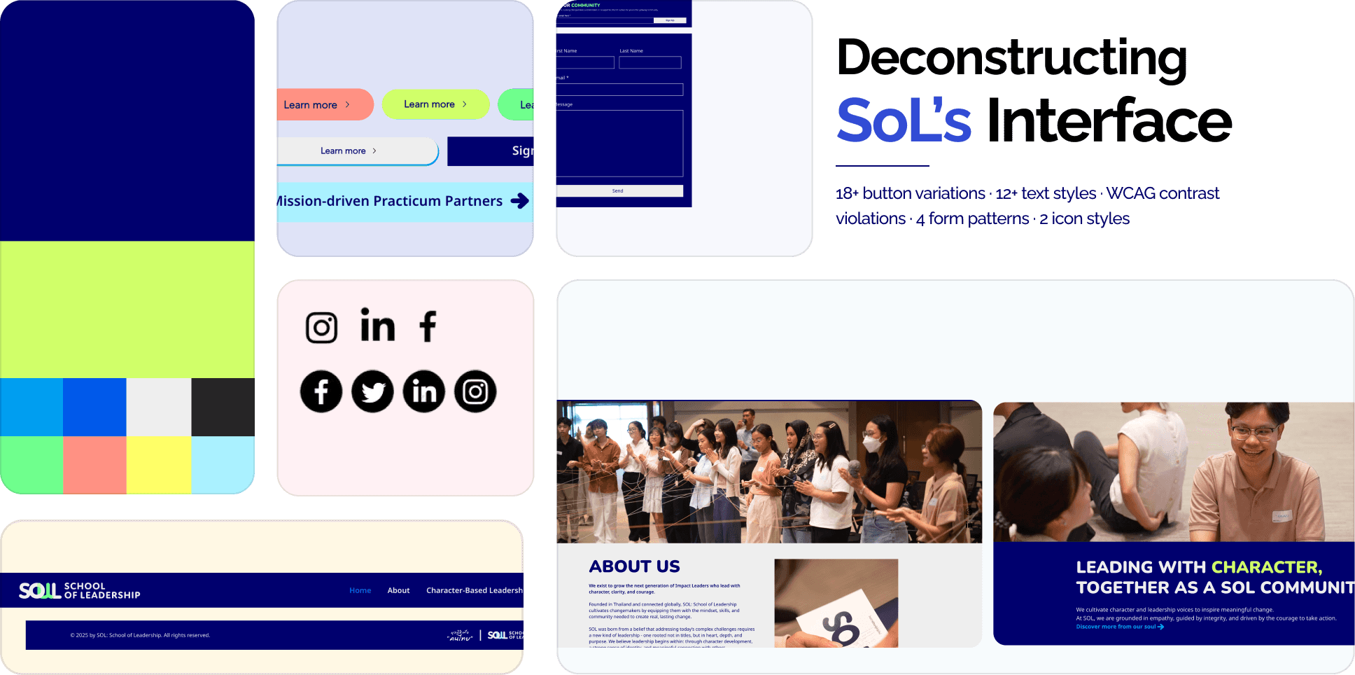
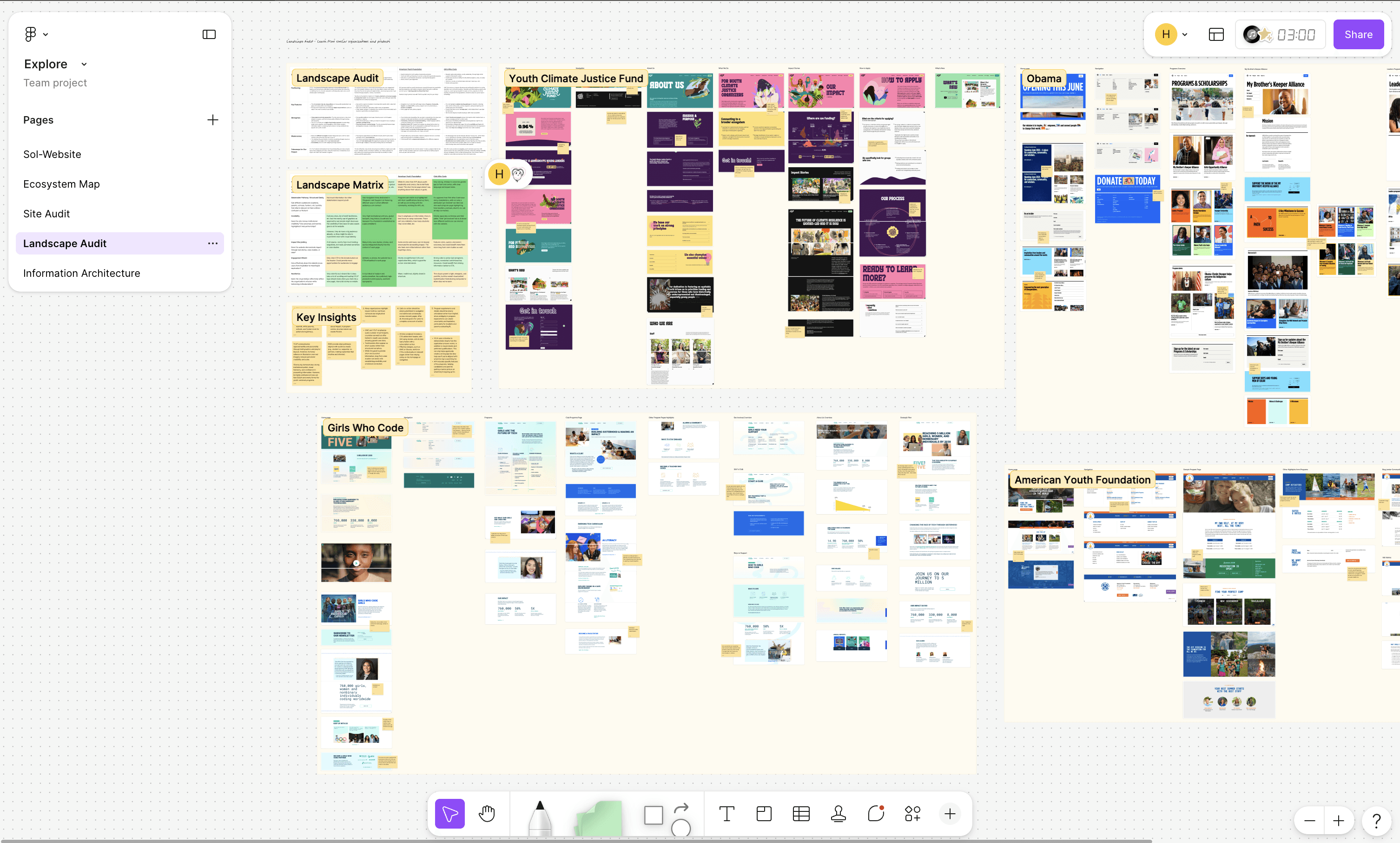
UI Inventory Audit (Every page solved the same problem differently)
The result wasn’t just visual inconsistency. It created friction across the entire product development lifecycle:
Slower page creation
Slower page creation
Increased maintenance complexity
Increased maintenance complexity
Harder onboarding for both users and developers
Harder onboarding for both users and developers
Uncertainty around future LMS integration
Uncertainty around future LMS integration
STAKEHOLDER BUY-IN
At the same time, SoL had recently gone through a rebrand and was moving toward a unified “One SoL” experience, which exposed an important reality:
The company didn’t just need redesigned screens. It needed a shared foundation capable of scaling across the product.

I proposed implementing Design Systems to streamline product development.
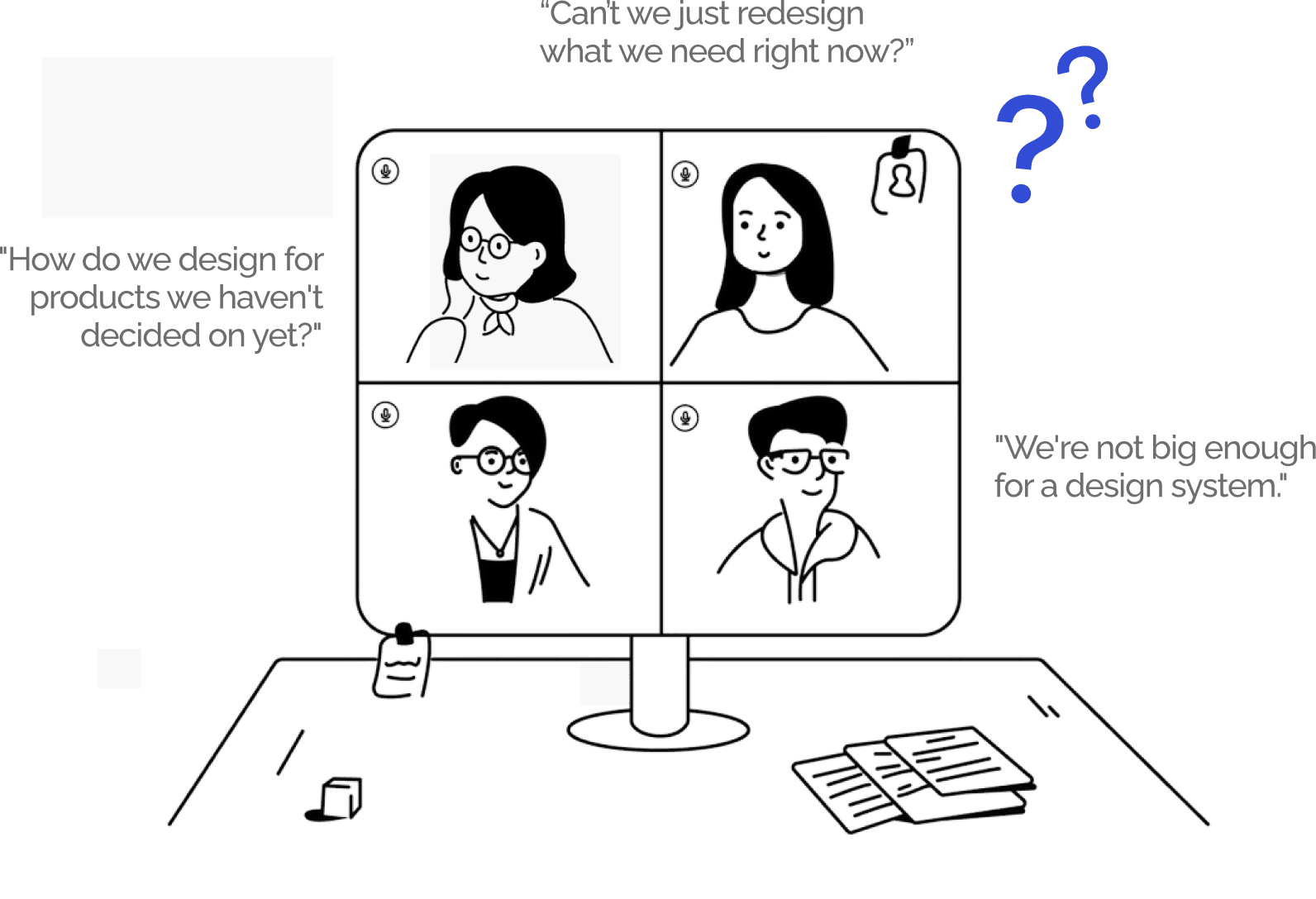
But, unfortunately, I failed to align the team around a full system-first approach.
Defining the Scope
Through the UI audit, I had enough evidence to make the case for a design system, but I learned that pitching the value wasn’t enough to secure buy-in for a full system and led a stakeholder workshop with design, engineering, content, and the founder to evaluate pages on SoL’s near-term roadmap.
Reframing the system pitch into voting for the highest-impact page
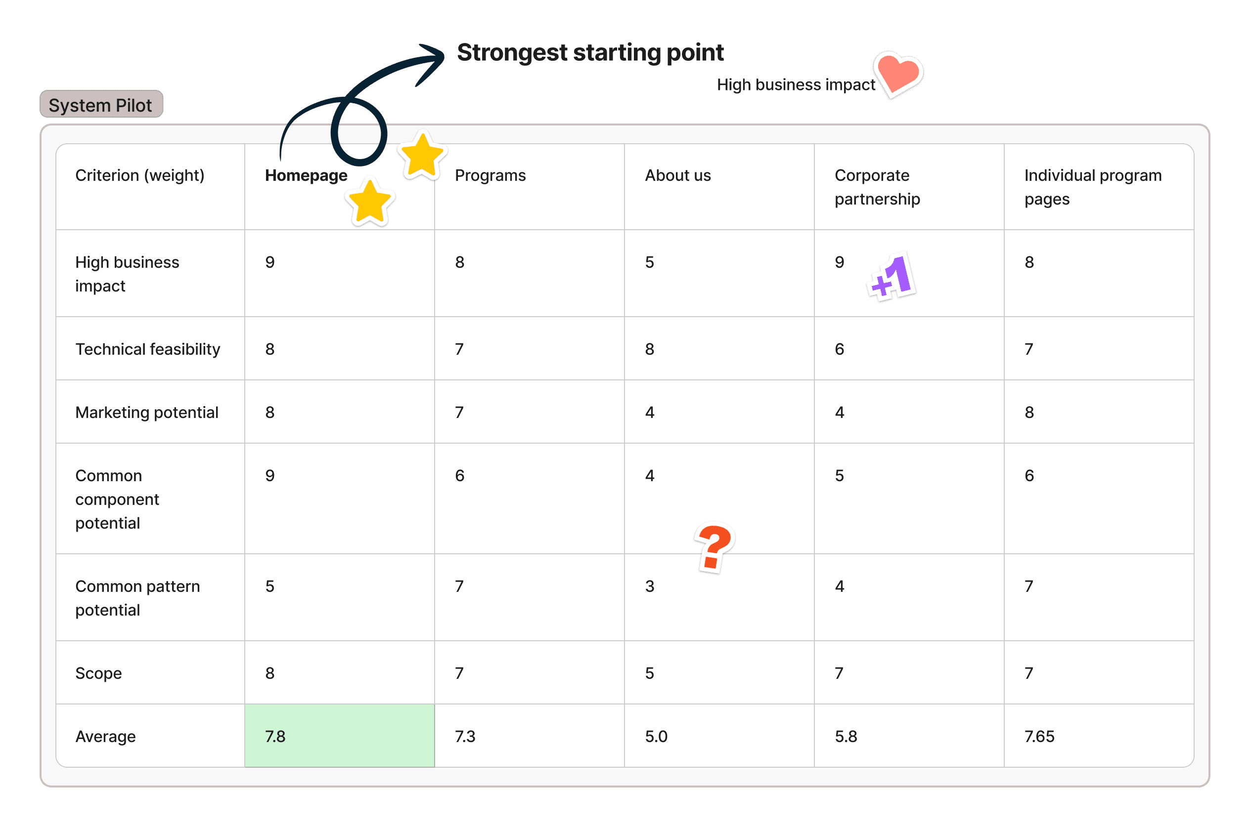
Design System Pilot inspired by Dan Mall (Start small, prove value, then scale)
Reimagining the homepage
I collaborated with 3 designers to synthesize user research into a clearer homepage strategy: what should stay, what to remove, & what needed redesigning to better support user & business goals.

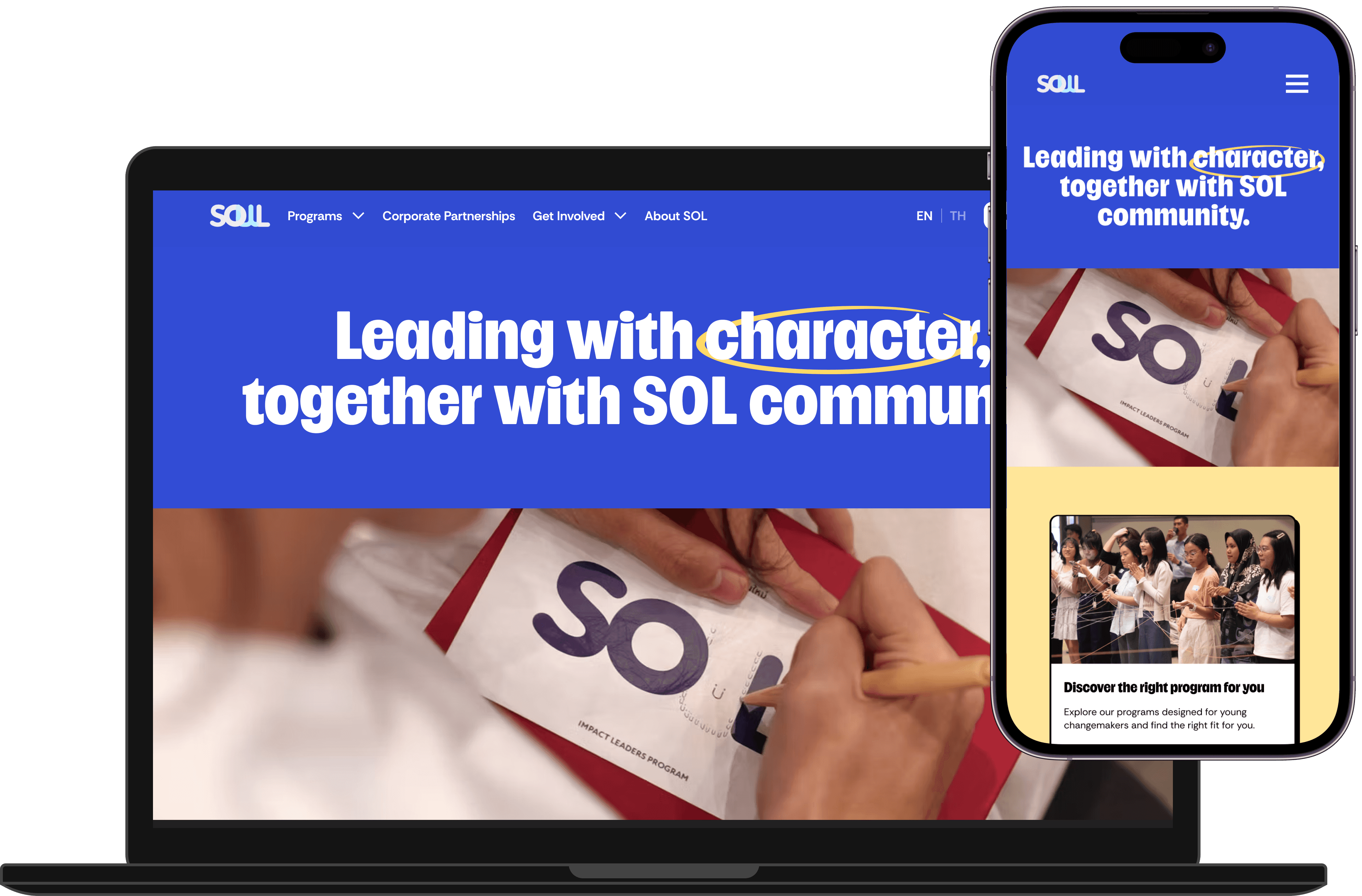
New Homepage (Not bad, right?)
From the new homepage, I identified sections that could become system components: patterns that solved immediate page needs while also supporting future pages and teams.
EXTRACTING COMPONENTS
How might we design a flexible card system that supports current pages and scales for future LMS needs?
Designed to support:
Program listings · Mentor profiles · Lessons · Course modules · Learning paths

Component Anatomy
How might we create an application form that builds trust and encourages action?
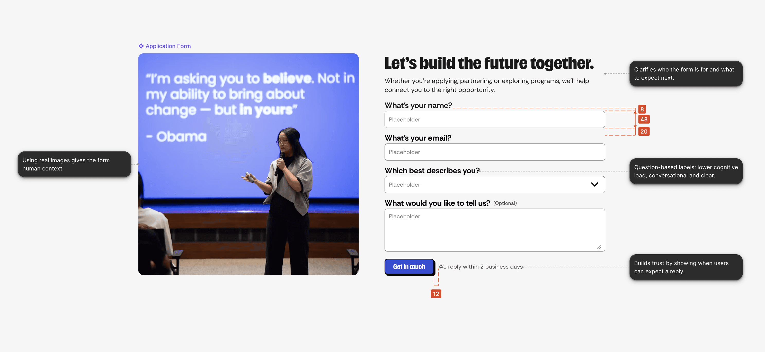
Supports different paths into SoL:
Applying · Partnering · Exploring programs · Getting in touch
States, sizes, optional labels, and helper text can be configured based on form needs
FINAL DELIVERY
Once the components were finalized, I documented the anatomy of each component, detailing its visual anatomy, behavior, and interaction states. This documentation was essential for maintaining consistency as the design system scaled
Reflections
Buy-in comes from meeting stakeholders where they are I learned that evidence alone doesn’t always create alignment. Connecting the system to business priorities & metrics helped get buy-in.
The design system should emerge from the product Starting with the product redesign helped us extract only the patterns that actually needed to scale.
Start with mobile-first for web: Designing desktop-first gave us flexibility, but mobile exposed gaps in spacing, hierarchy, and content behavior. Starting from constraints would have helped the system scale more intentionally.


Psst, you've reached the end…how about another story?
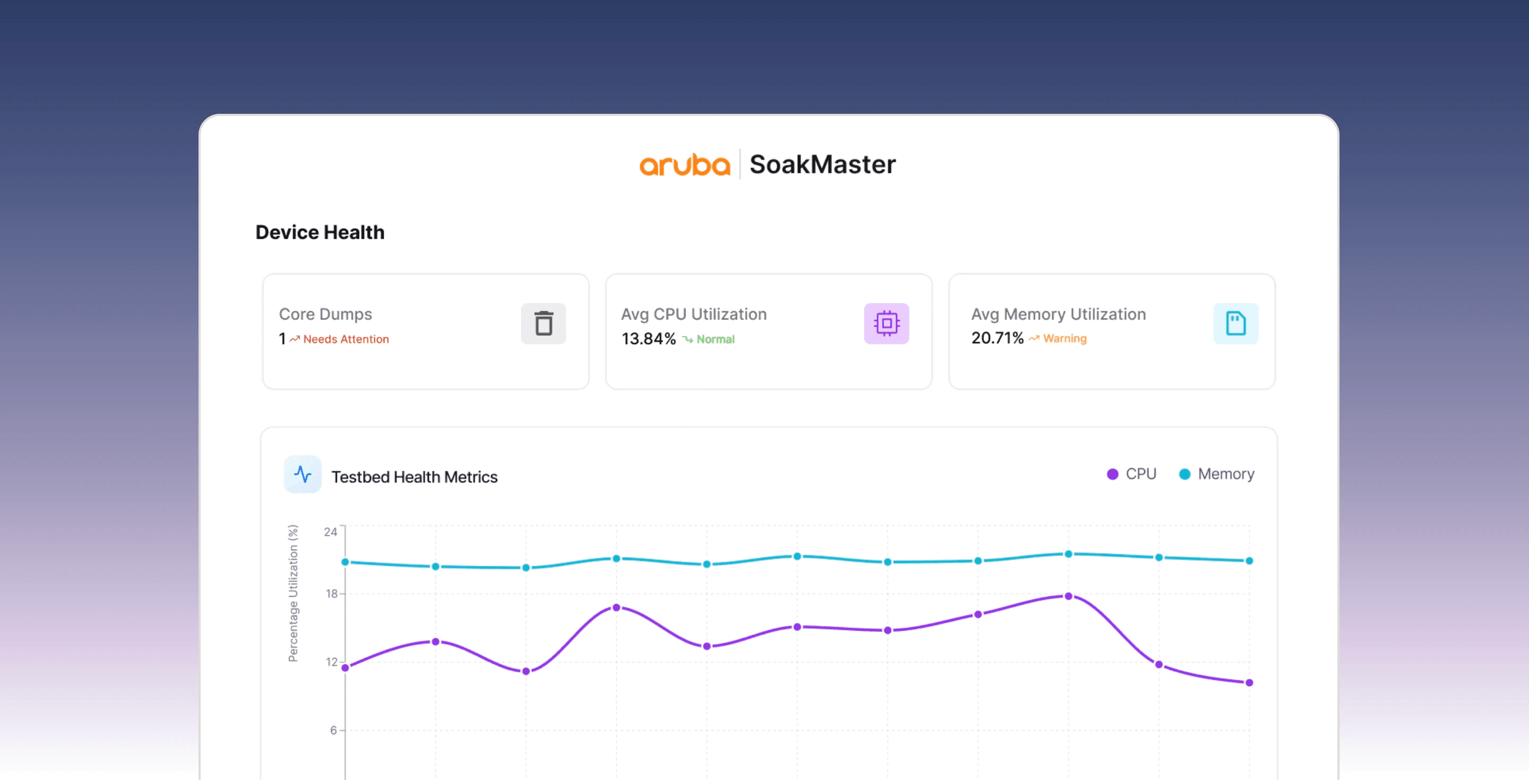
Driving team productivity with a dashboard that cut soak test time by 81%
Product Strategy/Enterprise Product
Say hello <3
Would love to talk projects, collaborations, or anything design!


Made with <3
SoL-School of Leadership
SoL is a leadership organization cultivating young impact leaders through real-world programs. But as it scaled toward corporate partnerships and a future LMS, 78+ UI inconsistencies made the product feel unfinished, weakening user trust and making future growth harder to support.
To support that scale, my team and I conducted research and redesigned the information architecture, navigation, and core flows. I also built SoL’s first design system from scratch: the architecture, UI inventory audit, 8+ reusable components, usage rules, documentation, and developer-ready handoff.
Handoff Complete
Role
Usability Testing, Ideation & Interaction Design
Timeline
Usability Testing, Ideation & Interaction Design
Team
4 UX Designers, 1 Design Mentor, 1 Developer, 1 PM
IMPACT
8+
Components
39%
Faster development
78+
Inconsistencies fixed
THE CONTEXT
School of Leadership (SoL) was scaling across new educational programs, corporate partnerships, and future LMS initiatives.
Project kickoff (Big vision, no scope: our favorite combination xD)
The Problem
But the product UI reflected the realities of fast execution: repeated patterns, inconsistent behaviors and pages built independently over time
UI Inventory Audit (Every page solved the same problem differently)
The result wasn’t just visual inconsistency. It created friction across the entire product development lifecycle:
Slower page creation

Increased maintenance complexity

Harder onboarding for both users and developers

Uncertainty around future LMS integration

STAKEHOLDER BUY-IN
At the same time, SoL had recently gone through a rebrand and was moving toward a unified “One SoL” experience, which exposed an important reality:
The company didn’t just need redesigned screens. It needed a shared foundation capable of scaling across the product.
I proposed implementing Design Systems to streamline product development.
But, unfortunately, I failed to align the team around a full system-first approach.
I proposed implementing Design Systems to streamline product development.
But, unfortunately, I failed to align the team around a full system-first approach.
Defining the Scope
Through the UI audit, I had enough evidence to make the case for a design system, but I learned that pitching the value wasn’t enough to secure buy-in for a full system and led a stakeholder workshop with design, engineering, content, and the founder to evaluate pages on SoL’s near-term roadmap.
Reframing the system pitch into voting for the highest-impact page
Design System Pilot inspired by Dan Mall (Start small, prove value, then scale)
Reimagining the homepage
I collaborated with 3 designers to synthesize user research into a clearer homepage strategy: what should stay, what to remove, & what needed redesigning to better support user & business goals.
New Homepage (Not bad, right?)
From the new homepage, I identified sections that could become system components: patterns that solved immediate page needs while also supporting future pages and teams.
EXTRACTING COMPONENTS
How might we design a flexible card system that supports current pages and scales for future LMS needs?
Designed to support:
Program listings · Mentor profiles · Lessons · Course modules · Learning paths
Component Anatomy
How might we create an application form that builds trust and encourages action?
Supports different paths into SoL:
Applying · Partnering · Exploring programs · Getting in touch
States, sizes, optional labels, and helper text can be configured based on form needs
Psst, you’ve reached the end…how about another story?
Driving team productivity with a dashboard that cut soak test time by 81%
Product Strategy/Enterprise Product
Say hello <3
Would love to talk projects, collaborations, or anything design!
Say hello <3
Say hello <3
Would love to talk projects, collaborations, or anything design!
Would love to talk projects, collaborations, or anything design!