

Saciva
Saciva is a student housing marketplace, providing homes, housemates, and essentials, but new users were dropping off before exploring or taking action, making the platform feel empty and limiting activity.
Saciva is a student housing marketplace, providing homes, housemates, and essentials, but new users were dropping off before exploring or taking action, making the platform feel empty and limiting activity.
My team and I delivered 9+ recommendations that reduced onboarding time by 62% and enabled first-try feature discovery, improving content discoverability, system clarity, and result relevance to drive adoption and repeat engagement.
My team and I delivered 9+ recommendations that reduced onboarding time by 62% and enabled first-try feature discovery, improving content discoverability, system clarity, and result relevance to drive adoption and repeat engagement.
Role
Usability Testing, Ideation &
Interaction Design
Usability Testing, Ideation & Interaction Design
Usability Testing, Ideation & Interaction Design
Team
4 UX Designers,
1 Design Mentor
1 Developer
1 PM
4 UX Designers, 1 Design Mentor, 1 Developer, 1 PM
4 UX Designers, 1 Design Mentor, 1 Developer, 1 PM
The Mission
Turning a first-time download into a reason to come back
Turning a first-time download into a reason to come back
Users struggled to find and evaluate relevant options and lacked clear reasons to come back and use the platform again.
Users struggled to find and evaluate relevant options and lacked clear reasons to come back and use the platform again.


Problem
New users were dropping off before discovering anything valuable enough to take action
New users were dropping off before discovering anything valuable enough to take action
Saciva aims to bring compatible rooms, roommates, and essentials into one platform for students navigating a new city.
A founder-led survey of 250+ students confirmed overwhelming demand: 93% wanted a trusted platform to find housing and roommates, yet new users were still dropping off before taking a single action, limiting Saciva's ability to attract and retain users.

Research
We conducted 8+ usability tests to understand user behavior and decision-making
We conducted 8+ usability tests to understand user behavior and decision-making
We knew that something was wrong, but not why. What better way to understand the process (and avoid assumptions!) then to ask the users and observe their interactions in real-time.
We knew that something was wrong, but not why. What better way to understand the process (and avoid assumptions!) then to ask the users and observe their interactions in real-time.
Goals:
Understand why users drop off after discovery
Identify what influences users to take action and contribute
Goals:
Understand why users drop off after discovery
Identify what influences users to take action and contribute
8 real users: 6 Students, 2 Recent Graduates

Usability Testing
Users couldn't discover, evaluate, or trust what was already there
Users couldn't discover, evaluate, or trust what was already there
Across 8 usability tests, I realized that users struggled to discover, evaluate, and trust what was already there, making them less likely to take action or contribute to the platform.
Across 8 usability tests, I realized that users struggled to discover, evaluate, and trust what was already there, making them less likely to take action or contribute to the platform.
What was preventing users from taking the next step?
What was preventing users from taking the next step?

Breakdowns across key tasks.
Mapping Insights
Transforming notes into insights
Transforming notes into insights
Affinity mapping our research revealed recurring patterns in how users struggled across five key pillars: onboarding, navigation, familiarity, trust, and communication:
Affinity mapping our research revealed recurring patterns in how users struggled across five key pillars: onboarding, navigation, familiarity, trust, and communication:
Onboarding friction slowed users before they could explore the platform
Unclear navigation and entry points made it difficult to discover core features
Weak filtering made it difficult for users to find relevant options
Users struggled to trust listings due to unclear details and missing credibility signals
Marketplace flows lacked structure, making it unclear how to browse or contribute
Post-Questionnaire Key Insights
Marketplace signal repeat usage potential
Marketplace signal repeat usage potential
Interest in Marketplace and roommate features (4/8 each) suggests these areas can support continuous user activity and returning behavior.
Interest in Marketplace and roommate features (4/8 each) suggests these areas can support continuous user activity and returning behavior.
Trust directly impacts retention
Trust directly impacts retention
4/8 users were unsure if they would continue using the app, revealing that a lack of trust and credibility prevented them from committing.
4/8 users were unsure if they would continue using the app, revealing that a lack of trust and credibility prevented them from committing.

Our North Star Guiding Principle
Enable users to quickly discover and trust relevant options, so they can take action and contribute to the platform
Enable users to quickly discover and trust relevant options, so they can take action and contribute to the platform
Key Insight 1
Onboarding friction and unclear navigation made it difficult to discover core features
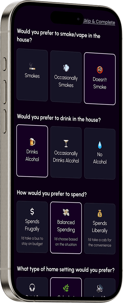
Users struggled to answer onboarding questions because location and preference prompts lacked context and felt restrictive, leading to hesitation and a less assured entry

Solution 1
Simplify location selection and expand preference options to make choices feel easier and more intentional
We clarified the purpose of location selection and introduced a more flexible preference model to make onboarding feel intuitive rather than restrictive.
This helps students understand why certain inputs were needed and gives them options that better reflect their real-life habits. It encourages students to complete setup without hesitation.


Key Insight 2
Unclear navigation made it difficult to discover core features
A lack of a persistent navigation bar and unclear iconography led to frequent mis-taps and extra effort while moving between core actions.
The unlabeled future features added to this confusion distracting them from the primary tasks.

Solution 2
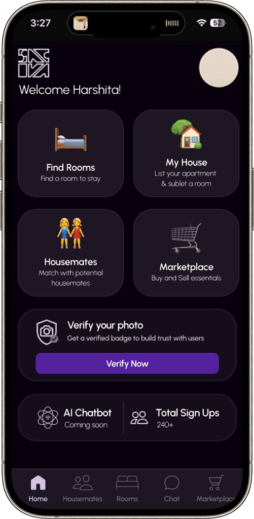
Introduce a consistent global nav and group primary features to make them immediately accessible
We added a global bottom navigation with clear icons so students always know where the core app features live, reducing mis-taps and backtracking between core actions

Key Insight 3
Users struggled to trust matches due to missing credibility signals and unclear details
Profiles had no verification, no history, and no visible reason to trust them.
Room and marketplace listings were missing basic details like lease terms, poster identity, and condition, so students couldn't evaluate fit without leaving the app to verify things on their own.


Solution 3
Add the missing signals: verification, match logic, and listing detail to build trust and reduce hesitation
We added verification badges and a compatibility breakdown so students can immediately see which profiles are real and why someone is a good match, not just that they are one.
For listings, we surfaced the most relevant details up front and added dedicated detail pages, so students can assess fit without guessing and wishlists so they can save what looks promising and come back when they're ready.


Key Insight 4
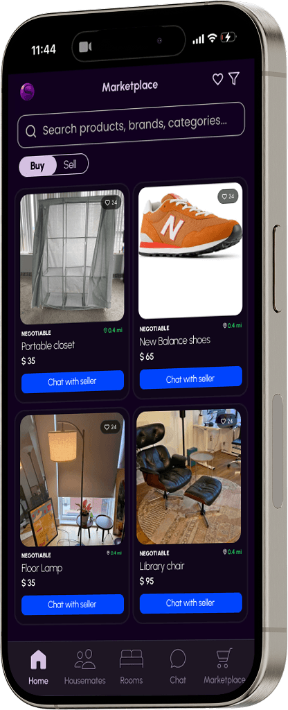
Marketplace flows lacked structure, making it unclear how to browse or contribute
Marketplace was hard to browse because buying and selling lived in separate pathways and category-heavy flows often led to empty pages, reducing confidence in its value

Solution 4
Unify marketplace flows to reduce confusion and make it easier for users to browse, list, and take action
We replaced the split buy/sell pathways with a single entry point and "Sell a product" CTA, and shifted focus from category-heavy paths to real inventory first

AI Recommendation 1
Integrate AI assisted search bar that works on top of the existing filters surfacing personalized results so students can spend less time looking and more time acting

AI Recommendation 2
Allow users to save searches and use AI to surface relevant results and timely alerts, making discovery faster and encouraging repeat engagement

Second Round of User Testing
How Users Responded to the Redesign
How Users Responded to the Redesign
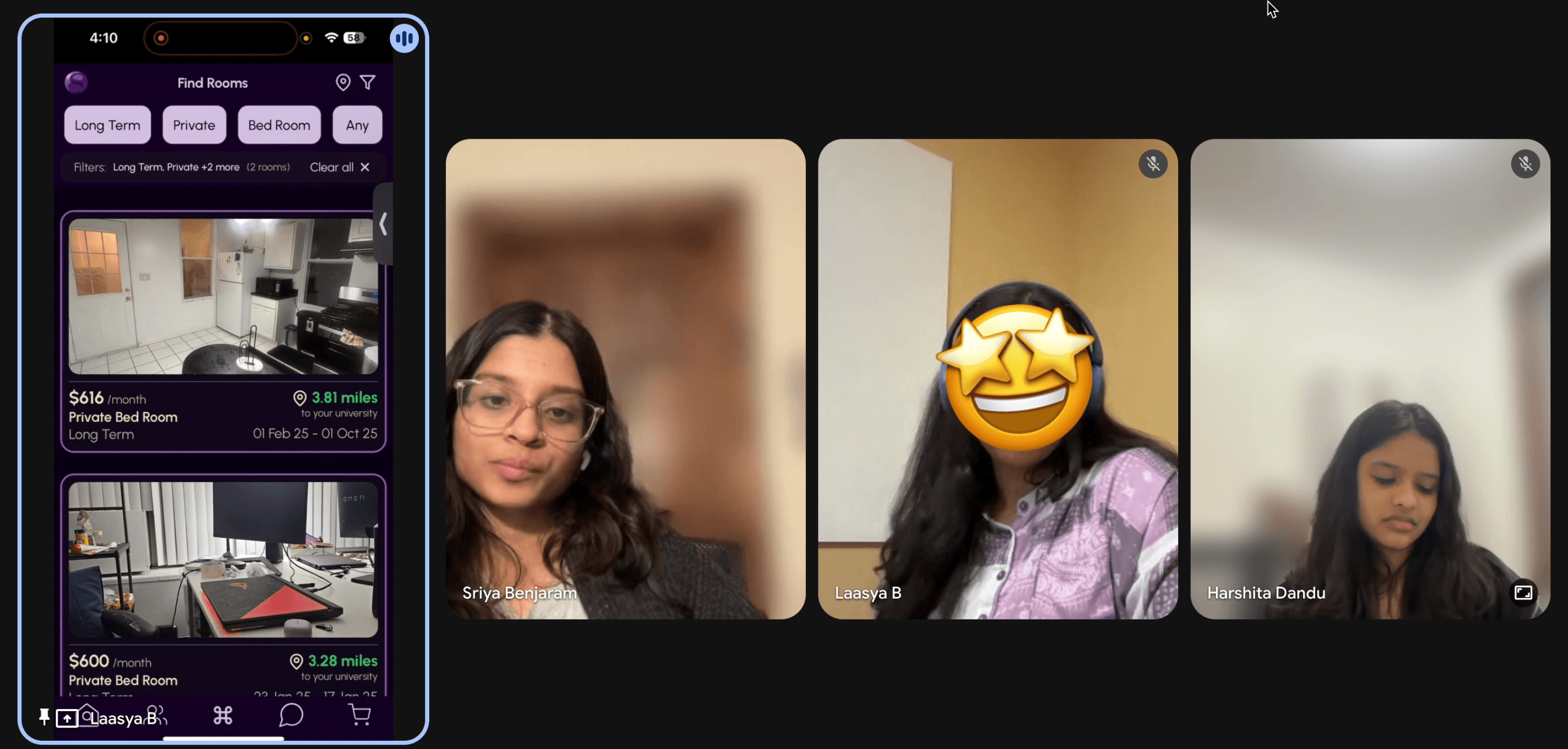
After ideating many wireframes, I consolidated our recommendations into a final prototype, for testing with 4 users.
After ideating many wireframes, I consolidated our recommendations into a final prototype, for testing with 4 users.
9:41
Final Prototype, made with FigmaMake & Vercel V0
Overall, user responses suggest that the redesign has strong potential to reduce time to complete key tasks and improve feature discoverability
Overall, user responses suggest that the redesign has strong potential to reduce time to complete key tasks and improve feature discoverability
~62 %
Reduction in time to complete onboarding
3/4
Found how to sell on first try and used product pages to evaluate listings
All 4
understood how the compatibility percentage was derived
Reflections
Technical constraints are design constraints. Not every feature was feasible in 4 months. Learning to scope, prioritize, and design for future extensibility was as important as the pixels.


Psst, you've reached the end…how about another story?
Psst, you've reached the end…how about another story?

Driving team productivity with a dashboard that cut soak test time by 81%
Driving team productivity with a dashboard that cut soak test time by 81%
Product Strategy/Enterprise Product
Product Strategy/Enterprise Product

Psst…this is just a preview, view the complete journey on a larger screen!
Say hello <3
Say hello <3
Would love to talk projects, collaborations, or anything design!
Would love to talk projects, collaborations, or anything design!


Made with <3